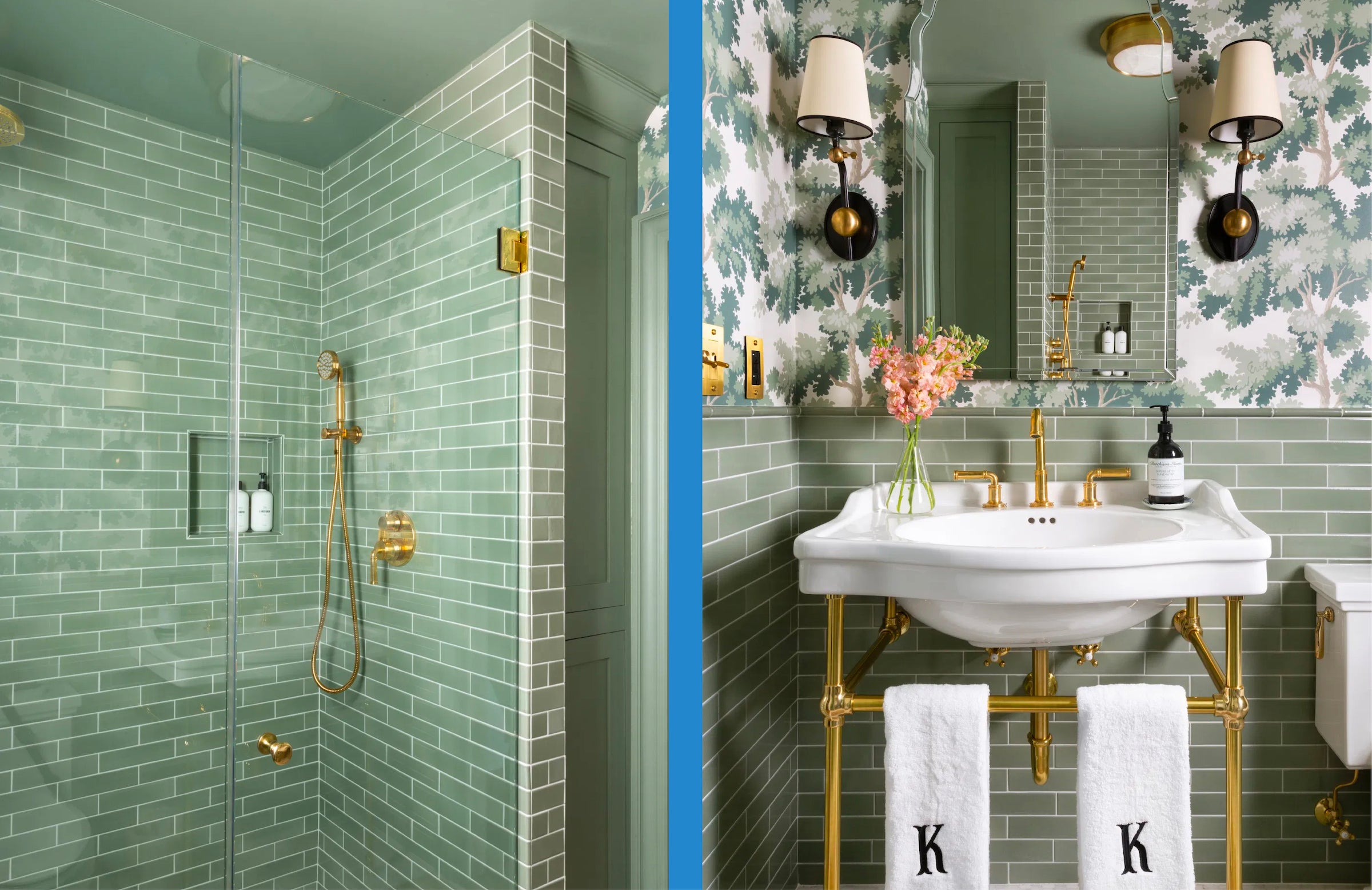
 It's no secret we have a thing for blue, but this green beauty designed by Erin Kestenbaum might have us turning a new leaf. The interiors blogger is renovating her 1940's colonial style Connecticut home with her husband, and their recent bathroom renovation is one for the books.
Tell us about yourself and the beautiful 1940s colonial home you’re redoing! When did you move in, and how long has your renovation been in the works?
We moved into our house about four years ago and while it was in livable condition, it was lacking character and interest. A big renovation had been done in the ’80s that had added a lot of square footage but hadn’t maintained the 1940’s charm. We have spent our nights and weekends since moving in tackling one room at a time, and in each space, we try to level up our design and skills. We’re nearing the finish line, with only a few rooms remaining, and are in love with the home we’ve created.

This bathroom... wow! How did you land on your wallpaper and tile selection?
After having installed handmade ceramic tile from Fireclay in our kitchen, I became obsessed with their assortment of colors and the warmth and history their tile brings to any space. I had also earmarked the Sandberg Raphael wallpaper years ago for our house but hadn’t yet selected where it would go. As soon as we knew this bathroom was up next to be renovated, I ordered all the blue and green tile samples from Fireclay and set off to find the perfect match for the wallpaper I loved so much. We landed on Rosemary, a mid-tone sage-y green, and instantly fell in love with the combination.
We’re often asked how to pair piping colors with wallpaper. With so many great potential options here, how did you decide to go with black?
It was such a hard decision! In this case, I pulled from the black in the lampshades, knowing that I already had so much green in the space. The black brings your eye downward towards the towels and I love the contrast of the crisp white against the black. That being said, I truly believe that so many different piping colors could look amazing in this space, and a different color, like pink or light blue, could have infused some whimsy into the space.

What is your best piece of advice for someone who wants to go bold in a room, but is nervous about resale?
I like to stick to a universally beloved color palette (like blues and greens) and keep colors in both in a more greyed-out space, rather than going all-in on vibrant colors. This helps to keep wallpaper and tile from reading as jarring or overwhelming, and instead feels more neutral and timeless over time.
And because we know you're curious, here is the before and after of the beautiful space:

Sourcing:
- Wallpaper: Sandberg Raphael Wallpaper
- Tiles: Fireclay tiles in "Rosemary"
- Sink: Cierra Large Porcelain Console Sink with brass stand
- Paint Color: Farrow & Ball Card Room Green in the Modern Emulsion Finish
- Sconces: Alton Pivoting Sconces
- Mirror: Uttermost Frameless Mirror
- Weezie Pick: Black Piped Hand Towels with Perry Embroidery in black thread
Quickfire:
- Favorite Coffee Table Book: Beata Heuman’s Every Room Should Sing
- Favorite Artist: Alexis Walter, she also has a wonderful textile line!
- Favorite Brands to follow on IG: Besides Weezie, Fireclay Tile (their Factory Friday series is the most fun!)
Thank you, Erin! You can follow along with Erin's 1940's home renovation on her Instagram. For more bathroom inspiration, check out our Sourcing Library.
